Shadow Divide - animated face
- 4.5
- Rating
- 10.00K
- Installs
- $1.99
- Price
 Analysis by App-foxy
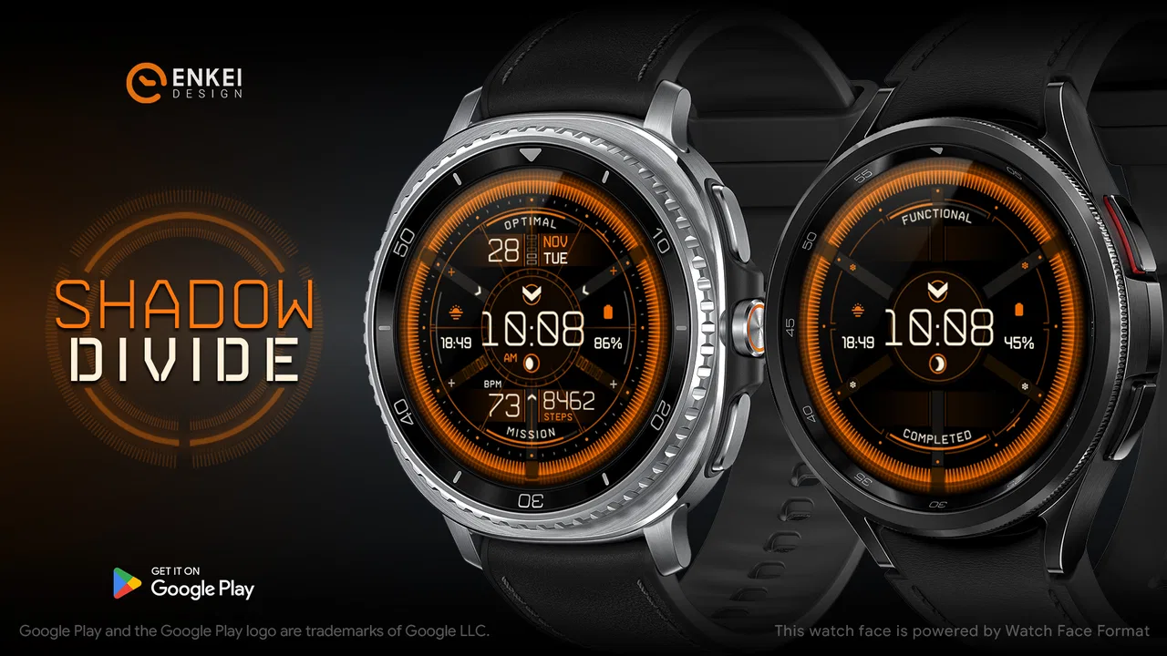
I approached Shadow Divide as a watch-face decision rather than simply another piece of digital decoration. It is a paid personalization app from Enkei Design, built around a gamer-inspired animated face with time and health information. That combination matters because a watch face has to do two jobs at once: look right on your wrist and remain practical when you glance at it quickly. In my experience, this one is most appealing when the visual identity is part of the reason you wear a smartwatch, not merely something you change once and forget.
The app costs $1.99 and is rated for Everyone, which makes the decision fairly straightforward for adults and younger users alike. It has reached over ten thousand installs, with an average rating of 4.5 from hundreds of ratings. Those figures suggest a small but clearly interested audience rather than a mass-market utility. I would read that as a sign that the face has a specific personality: it is designed for people who actively want a gaming-flavored wrist display, not for someone searching for the most neutral possible clock.
What to consider before choosing it
My first test for any watch face is legibility. Animation and strong visual styling can easily compete with the actual time, especially when the screen is viewed outdoors, at an angle, or during a quick glance while walking. Shadow Divide works best if you enjoy a dramatic presentation but still expect the main time display to remain the visual anchor. Before installing it, I would ask myself whether I want my wrist to feel like an extension of a game setup or whether I mainly need a quiet, information-first layout.
You May Also Like

 AccuWeather: Weather Radar
AccuWeather Review: A Quick, Clear Forecast for Everyday Decisions
For everyday plans, the best forecast is the one you can understand quickly. AccuWeather makes rain timing, radar, and local conditions easy to act on, with a few trade-offs.

 Hill Climb Racing
Why Hill Climb Racing Still Turns Crashes Into One More Run
A tiny car, a bumpy hill and one more upgrade: Hill Climb Racing keeps resurfacing because its simple chaos makes every near-miss feel personal.

 AliExpress - Shopping App
AliExpress Makes Global Shopping Feel Personal, but Shoppers Bear the Risk
AliExpress turns a global marketplace into a pocket-sized discovery engine. Its reach is useful, its shopping loop compelling, and its trade-offs easy to miss.

 Lords Mobile: Kingdom Wars
Lords Mobile Is a Kingdom-Building Routine, Not a Quick Match
A case-by-case verdict on the building, battles, device demands, and social commitments that make Lords Mobile rewarding for some players and exhausting for others.

 PDF Scanner app - TapScanner
TapScanner Makes Paperwork Easier to Capture, Check, and Share
TapScanner makes scanning with a phone feel less like a rescue operation and more like a dependable step in getting work done. Its capture tools are useful, though not flawless.

 Block Blast!
 Shows How Much a Puzzle Game Can Leave Out
A quiet grid game shows why puzzle players increasingly value instant clarity, repeatable skill and low-pressure play—and where the genre still needs to catch up.
More From Our News Desk
View All News

The second decision point is information density. The face includes useful time and health information, but a watch face should not be judged only by how much it can show. The more indicators appear around the central time display, the more important spacing and visual hierarchy become. I prefer a layout where I can identify the time immediately, then check health details when I deliberately look closer. That makes it more useful during a normal day than a design that looks impressive in a screenshot but becomes tiring to read.
The third factor is how often you change faces. If you switch between a work layout, a fitness layout, and a weekend style, a distinctive animated design can be a welcome part of that rotation. If you want one face to disappear into the background for months, a calmer alternative may suit you better. The value here is not only the information on screen; it is the feeling of wearing something with a clear theme.
I also consider the purchase differently from a subscription. The $1.99 price is a small one-time decision, so I would not expect the same breadth as a large catalog of interchangeable faces. The question is not whether it replaces every other face. The better question is whether this particular visual direction is worth adding to your rotation. For a gamer or a fan of animated personalization, that is a much more favorable comparison.
How the animated style changes daily use
Animation gives the face more presence than a static clock, but it also changes how I interact with it. A static face can become visual background after a few days. An animated one keeps drawing attention, which may be exactly what you want when the watch is part of your personal style. On the other hand, I would avoid treating the animation as a reason to stare at the display. The most successful use is a quick glance where the movement adds character without delaying the information I need.
There is a useful trade-off here: a more expressive face can make a basic smartwatch feel less ordinary, while a minimalist face usually makes the device feel more like a tool. Shadow Divide belongs firmly on the expressive side. I would choose it for evenings, weekends, gaming events, or any setting where a themed look feels natural. For a formal workplace, a restrained alternative may communicate less personality and create less visual distraction.
Using the health information without overreading it
The health information is a practical addition because it gives the face a purpose beyond appearance. I like the idea of seeing time and health-related details together, but I would treat those details as convenient glanceable indicators rather than a replacement for a dedicated health screen. A watch face is valuable when it helps me decide whether to open the full app, start moving, or simply continue my day. It is not the right place to interpret every measurement in depth.
A realistic example is a workday when I have been sitting for too long. A quick glance at the face can remind me to check my current health information before I leave my desk. Later, during a walk, I can use the face as a compact overview instead of opening a separate screen each time. That workflow makes the design more useful than a purely decorative gamer face, while still keeping expectations realistic: the face supports awareness, but it does not turn the watch into a complete health coach.
For anyone who relies heavily on health tracking, I would compare the layout with the watch’s own health-focused options before committing to it. A purpose-built fitness face may be better when exercise metrics are the main reason for wearing the device. Shadow Divide makes more sense when health information is one useful layer within a broader visual theme.
Where this face stands out
The clearest strength is its commitment to a gamer aesthetic. Many personalization choices are either generic digital clocks or broad collections with no strong identity. This one has a defined mood, and that makes the choice easier. I do not need to wonder what kind of experience it is aiming for. If I want an animated gamer watch face, Shadow Divide is immediately relevant; if I do not, its visual direction is unlikely to win me over through practicality alone.
That focus also gives it an advantage over ordinary static faces. A static design can be clean and readable, but it may not feel connected to the rest of a gaming setup or personal style. An animated face can bridge that gap between the watch and the devices, wallpapers, accessories, or clothing I already use. I would especially appreciate that continuity when customizing a new smartwatch and wanting the first impression to feel intentional.
Another strength is the balance between theme and utility. The face is not presented as animation alone; it includes time and health information, so it can remain on the wrist during normal routines. That matters because I do not want to change back to a plain face every time I leave the house. A themed design that still supports everyday glances has more staying power than a visual novelty with no practical role.
The app’s scale is also worth interpreting carefully. With over ten thousand installs and a 4.5 average rating, it has a modest footprint but strong visible satisfaction among its audience. I would not use that as proof that it suits everyone. I would use it as reassurance that the concept has found people who appreciate this kind of personalization. For a niche design, that is more meaningful than broad popularity alone.
Three ways I would get more from it
First, I would use it as a rotation face instead of forcing it to serve every situation. Keeping a neutral face for formal appointments and a health-focused option for workouts lets Shadow Divide do what it does best: provide a strong themed look when I want personality. This avoids the common mistake of judging an expressive face harshly because it is not ideal for every environment.
Second, I would evaluate it after several ordinary days rather than after the first installation. The important question is whether I can read the time without consciously searching for it. I would check it in bright light, indoors, and during movement. If the animated elements remain enjoyable while the information stays easy to find, the face has earned a permanent place in my rotation. If the motion becomes distracting, I would reserve it for occasional use.
Third, I would use the health information as a prompt for action, not as decoration. For example, I might glance at it before deciding whether to take a short walk or after returning from one. That turns the face into a small behavioral cue. The insight is that its value comes from combining a look I enjoy with information I might otherwise ignore; either part alone would be less compelling.
The friction points I noticed
The same personality that makes the face interesting can limit its audience. Animated visuals are not automatically better for readability, and a gamer theme may feel too loud for someone who prefers understated design. I would also expect the face to be less satisfying for users who want extensive customization across every visual element. Its appeal comes from a coherent identity, so people seeking a completely personalized dashboard may prefer a broader customization tool or a face collection with more layout choices.
There is also a psychological cost to a busy watch face. Even when the information is useful, seeing several elements at once can encourage unnecessary checking. If I am trying to reduce screen time, a calmer face may be the smarter choice. Shadow Divide is designed to attract the eye, and that is a benefit for personalization but a possible drawback for digital minimalism.
The one-time price is reasonable, but it still changes the standard I would apply. A free face can be judged as a harmless experiment; a paid one should earn regular use. I would make the purchase only after deciding that the gamer aesthetic is genuinely something I want on my wrist. The low cost reduces the risk, but it does not remove the central question of fit.
When another type of watch face is better
I would choose a minimalist digital face instead if my priority were instant time reading with almost no visual competition. That category is better for office routines, frequent short glances, and people who dislike animation. It may also be the safer choice for anyone sensitive to motion or who wants the watch to remain visually quiet.
A health-first face would be more suitable for someone who spends most of the day monitoring exercise or wellness information. Such a face can give those measurements more room and make them easier to prioritize. Shadow Divide includes health information, but its main identity is still personalization. If the watch is primarily a training instrument, I would put function ahead of theme.
A larger customization platform may fit users who want to build a very specific arrangement of colors, complications, and indicators. That route offers more freedom, but it can also require more setup and ongoing adjustment. Shadow Divide is appealing precisely because it offers a ready-made visual concept. I would rather install a finished design than spend an evening constructing one when the gamer look already matches my taste.
Finally, a static themed face may be preferable if battery awareness or visual calm is especially important. I would not assume that animation automatically causes a serious problem, but I would still consider it part of the trade-off. The point of choosing this app is the animated presentation, so someone who does not care about that aspect should probably spend the money elsewhere.
What switching feels like in practice
Changing to Shadow Divide is not only a design decision; it changes what I notice during the day. A familiar neutral face becomes invisible, while a themed animated face remains part of the device’s character. I would give myself a short adjustment period before deciding whether the layout works. The first impression may focus on the artwork, but the long-term test is whether I can read the time and health information naturally without feeling that the screen is performing for me.
If I later switch back to another face, the purchase still makes sense if I use it for specific contexts. I do not need every watch face to be permanent. A weekend rotation, gaming session, or evening style can justify a small one-time purchase even when a simpler face remains my daily default. Thinking of it as part of a wardrobe for the watch makes the cost easier to evaluate and prevents unrealistic expectations.
For a new smartwatch owner, I would install it after learning the basic watch controls rather than using it as the only way to judge the device. That makes it easier to separate the face’s design from the watch’s own behavior. I would also check the health information during a normal day, not only while testing the animation, because the practical value appears in routine glances.
My recommendation
I recommend Shadow Divide to people who want their smartwatch to show personality, especially gamers and anyone drawn to animated digital design. The combination of a strong theme, everyday time display, and health information gives it more purpose than a decorative wallpaper. Enkei Design has kept the concept focused, and that focus is the main reason I would choose it over a generic face.
I would skip it if I want a silent, minimalist display, need a workout-first dashboard, or expect deep control over every part of the layout. In those cases, a simpler or more specialized alternative will probably feel better every morning. The app is not trying to be all things to all users, and I think that is an advantage as long as I make the choice honestly.
At $1.99, I see it as a low-cost style purchase rather than an essential utility. Its 4.5 average rating and growing audience make it a credible option within its niche, while the Everyone age rating keeps the choice broadly accessible. My final advice is simple: choose it when the animated gamer identity is the feature you actually want to wear. If that description makes you smile, the practical time and health details give the design enough everyday value to justify a place in your watch-face rotation.
FAQs for Shadow Divide - animated face
01What is Shadow Divide - animated face?
Shadow Divide - animated face is a personalization app designed to give your device a distinctive animated appearance. It focuses on dark, atmospheric visual effects and moving face-inspired artwork that can make a lock screen, wallpaper, or display feel more dynamic. Before downloading, check the app’s current description and screenshots to confirm which features are supported on your specific Android or iOS version.
02How do I use Shadow Divide - animated face after installing it?
After installation, open the app and review its available animated designs, customization controls, and permission requests. Depending on the version, you may be able to preview an animation, adjust visual settings, and apply it as a wallpaper or background through the device’s own personalization menu. The exact steps can vary by operating system, so follow the in-app instructions rather than assuming every option works identically on Android and iOS.
03Does Shadow Divide - animated face drain battery or use a lot of storage?
Animated wallpapers and continuously moving visual effects generally consume more battery than static images, especially on phones with high refresh-rate displays. Shadow Divide - animated face may also require additional storage for downloaded themes or media. In testing any animated personalization app, it is sensible to monitor battery usage after applying it and disable animation when traveling, gaming, or trying to extend battery life.
04Is Shadow Divide - animated face free to download and use?
The app may be available as a free download, but some designs, customization tools, or ad-free features can depend on the developer’s current monetization model. Check the store listing carefully for in-app purchases, subscriptions, advertisements, and trial terms before confirming installation. Prices and included content can change, so the information shown in Google Play or the App Store should be treated as the most accurate source.
05What permissions and privacy concerns should I consider?
Before using Shadow Divide - animated face, review the permissions requested during setup and compare them with the app’s purpose. A wallpaper or animation tool should clearly explain why it needs access to items such as notifications, media, or device settings. Read the developer’s privacy policy and store disclosures, and avoid granting optional permissions that are not necessary for applying or displaying the animated design.
Pros
- Fun animated effects make selfies and profile photos more expressive.
- Simple interface lets you apply effects with minimal editing experience.
- Useful for creating eye-catching social media posts and avatars.
- Offers a playful way to experiment with different facial appearances.
- Quick previews make it easy to compare effects before saving.
Cons
- Some effects may look unnatural or reduce facial detail.
- The app may require strong lighting for accurate face detection.
- Frequent animations can drain battery during extended use.
- Export options may be limited compared with advanced photo editors.
- Privacy settings should be checked before granting camera access.

Shadow Divide - animated face
Gallery